


So I've spent the last 8 hours playing with Pa(le)ttern Generator and Photoshop. I knew I could use the shape and palette to help get started with digital paintings. I've always found that getting started on a painting is the toughest part. I sometimes get too hung up on what I'm trying to say that I'm not thinking about new ways of learning how to say it and I set myself a very difficult task… othertimes I just go with the flow, cut loose, and let my imagination wander. I always like my painting more when I go this route. I learn more about image making and I don't spend so much time applying what I already know and I can learn knew techniques better.
So I gave myself the assignment of using the Pa(le)ttern Generator to limit my color and composition and just play in the more random computer generated sandbox. It was an enlightening experience.
The images in this post are the results. You can see the original Pa(le)ttern above the painting it inspired.
If anyone wants to let me know which ones they like and which they don't that'd help me refine my style. As much as I like making paintings just for my own amusement I am trying to become a pro at this so knowing what I do that others like the most will help me making images other people can enjoy too, and other will want to buy so I can keep my illustration ship afloat.


My Day Has Come
I was pretty clueless at the beginning. I just looked at the pattern and doodled what it symbolically reminded me of. I didn't really use the palette given to me here. The pattern is very simple on this. I used a pretty small square size and only two colors. I found three colors are a better seed than two for a really fresh palette.


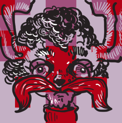
Bunny Crushers Identity Remains A Secret
This process is like making fan art for Nintendo Power. You start with a video game sprite and work backwards to create really detailed fantasy images. I'm still really simple and cartoony hear but I got much more complex as the night went on.


All Seeing Paisley Eye Of Destruction
On this one I lost my anchor and started doodling. At one point the idea of a paisley skull entered my brain. Something that looked like Prince's guitar solo in "Let's Go Crazy". Then I got bored and just starting putting lines every where. This is the first pattern I used 3 colors. At this point I haven't made the connection that I can use the color more to my advantage and use it in my brush strokes. I'm thinking in sharpie on pieces of construction paper mode on this one.


Iyiyi, Sir.


I'm Ascending, Bibbles.
I tweaked the colors in this one to differentiate the palette from the one before. I liked this religious detective bunny thing going on here. I don't know what the bird is all about. I called the file "I'm Ascending, Bibbles". Bibbles being that fake word that Wyatt Cenac uses all the time when playing Ex- RNC Chairman Michael Steele as a Muppet on the Daily Show. It's been popping into my head. I think the blue color here is the same blue as the Michael Steele puppet that's why it triggered to soundclip in my brain.

Sean Magee-Jack Rabbit-Jerry Curl-Hybrid
This one was the first where I used a color in the original palette to give texture. The straight strokes are kinda crappy looking. It makes it look primitively graphic. I should have used more natural fur texture. Oh yeah and something in the original pattern made me think of my friend Sean Magee. So I gave the bunny Sean's but Bambified. I still don't think this one is successful but I'm starting to get there. I have a clue at this point.


Chicago Bull Inner-Tube
I'm using squares in a more sophisticated way here. I'm less a slave to them here... using them more like loose inspiration


Sheep Terror With Something Extra


Kali-Ma-Ma-Mia!


Nerd Dino


Girly


Gangster Octopus Hed
Something clicked on this one and I knew I had discovered something useful on this one when I really started to deviate from the patterns and employ outside colors in tiny bits. At this point it became more about my painting than the pattern that inspired it.


Bull Pucky
At this point I'm thinking more like a painter than I guy with a marker... even though I was using a digital palette. My mindset had changed. I felt like I was about to make a giant leap in quality.


I'd Like To Report A Squid Attack
This one was almost there. It still looks to skateboard and surf board graphic for me. Too many brights.


George Carlin As A Sheepdog Discovers Meta-Cognition
I really liked this one. I'm still using black at this point. It gives the image a kind of amateurish look, but I like it anyway. George Carlin As a Sheepdog looks a bit like Screwy-Squirrel.


Mintotaur iPhone Pitchman Worried
Porcelain Goddess Erases Gremlin King

Old Man Bunny Experiences Head Trauma
I knew after I painted this that I had made some personal breakthroughs. I really liked the color on this. If I were to reproduce this on a canvas in real life I would have to use a glow in the dark acrylic for the light color

Salamander In A Plastic Bottle Wanders Through Dry Ruins
I was especially pleased with this one. At first I thought the colors were terrible, but I REALLY warmed up to them after the image started coming together. I find the three color random palette to be the best place to start, but you have to be selective about which three colors you choose. One that has a dark, midtone, and light color work the best. I also didn't use any black on this one. The dark green is a more attractive dark color in my opinion.
No comments:
Post a Comment