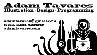
I'm going to get a stamp made so I can make these cards as needed. I need to drum up a little business. Don't call that number. It's not mine. It's just a place holder. I didn't want some Internet troll calling me to hassle me for no reason. Of course that's not you!
Did most of the layout in Photoshop. The logo was designed in Illustrator.
Not sure if I like having that much white-space in the lower left corner. I like the font. It has the right balance between slick and fun. There will be more of that slick and fun slash low-budget craftiness when imperfections from actually stamping cards are introduced. ( I love those imperfections. The kind that pop-up within formal slickness. It's a sign things have room to change and evolve. )
Whattaya think? If a fella handed this to you would you think he had design and illustration chops?

2 comments:
Love it! I actually like the white-space in the lower left corner. Keeps the card from looking too busy.
What font did you use? I'm digging it. - EVL
It's called Blackcloak Std.
It comes standard with OSX. It really changes character when you stretch it. It's quickly becoming my preferred headline eye-grabber font.
It has a subtle western flavor to it.
Post a Comment